HoliDAY MEMORIES

Watercolor image child sleeping on the stairs in red pajamas with christmas tree branch in foreground
Anticipation, watercolor, 8.75″ x 5/75″, ©1980


I was moving things around to make way for a construction project in my home.  Most of what needed moving was art and art storage, and the tables I use for matting and framing work.  Of course most of it ended up in the studio,so normal workspace areas were not available for a while.

I took the opportunity to browse through some of the boxes of wrapped work that had been tucked away in a closet for a long time.  I found a number of pieces I had forgotten about.  Two were sweet little watercolors of holiday themes.  Both derive from my memories of holidays growing up in Pittsburgh.

The first, “Anticipation”, is a an imagined view of myself fallen asleep in the stairs, having crept down to peek through the railings to see if Santa had come.  I remember peering through those railings at my mother with my younger brother as a baby, but of course I don’t remember falling asleep on the stairs – that part of the story comes from my parents telling of finding me there. 


The Stage is Set, watercolor, 5.5″ x 7″, ©1980


The second is a classic Christmas scene of a decorated tree and a cheerful file in the fireplace, with a rag rug on the floor.  This too is an imagined scene made up of remembered furnishings from my childhood home

This one brings back memories of decorating the tree with my many siblings.  We had many glass ornaments that were very fragile, so there were also some sturdy (and not really very attractive) plastic ones for the littler kids to hang on the tree.

Not shown is the train set from the 1920’s that was usually installed around the base of the tree.  One of my brothers now entertains his grandchildren with that old Lionel set, which was still running, last I heard!


Read more >

Printing Limited Editions

One of the wonderful attributes of original printmaking is that, once you have created the plate, you can choose how many times to print it.  More than one person  can acquire your original work because each impression pulled from the plate is an original print.  There are a variety of factors that influence the number in a limited edition of original hand-pulled prints.

Deciding on edition size

Lion, drypoint on plexiglass, ed. 5

Most of my editions are around 25.  This number was arrived at rather arbitrarily, thinking about the number of hours that go into developing a plate, and the relatively low price collectors will pay for a print as opposed to an oil painting, especially for a young artist just starting out.  I toyed with an edition of 40 and a few editions of 16 or 20, before deciding that 25 seemed like a good number.  Some plates have  a naturally limited number. Drypoint on plexiglass, for example, only holds up for about 5 prints before it loses it’s special line qquality. Drypoint on zinc may hold up for 20 oe 25 before you can see the wear on the plate.  Other plates, such as a zinc etching or a collagraph made from Masonite and acrylic medium, may physically hold up for considerably  larger editions.

There may be market reasons to increase the size of the editions.  There was a period of time during which my work was represented by a wholesaler to the design trade.  Because of the investment they would make in marketing materials (this was before the internet and easy digital reproduction and distribution of marketing materials), they needed the editions to be no smaller than 100 and and requested even larger editions of 150 for some images.  

I knew that technically this should be feasible – zinc plate should hold up for that many prints, I had been told, though I had not printed an edition that large.  My collograph plates seemed likely to be even more durable, being well coated with acrylic medium as a final coat regardless of what materials went into creatin

Anthurium, collagraph

g the plate.  That sounded like a huge number  to print, but they were willing to buy prints outright in lots of 10  or 20 at a time rather than take them on consignment, so I was willing to set larger editions for those works.   You will find a few editions from that time period that number up to 150.  Read more >

Indian Summer, viscosity etching, ed. 20.  Entire edition printed at once in 1982

ensuring consistent prints can be achieved

Since most of my plates require multiple colors of ink and the wiping of the plate  involves strategies to blend colors or retain discrete areas of color, I started making detailed notes.  I wrote “recipes” for the colors, especially when mixing several to get an exact hue.  Wiping plans  included the order of application of color to the plate, and how “clean” each color was to be wiped before application of the next color and sometimes even which direction to drag the rag across the plate.  Finally, I saved packets of color in aluminum foil and sealed in sandwich bags, to have a sample of the ink to use in mixing a matching  batch later, if necessary.

I tried to always take these steps in order to ensure consistent results, and over the years I found them to be very helpful..There are a number of editions that have been printed incrementally in batches of 5 or so at a time.

Deciding whether to Print  the entire edition at once

In the early years, I printed editions out and canceled the plate before moving on to the  next print.  This changed when show deadlines started to come up faster than I could print out all that edition work.  It was important to create new work for the shows so I bagan to print out a few for each plate – the “bon a tirer” or match print, which would remain in my records, and then numbers 1-3 or 1-5 – enough to get the prints for the show and maybe have a matted impression or twp for the bin as well.

Quickly this became the practice, because making new work is always more fun than printing out the edition even when there are no deadline pressures!  Not to mention that having entire editions printed is a significant investment in paper, ink, and time – and storage space.  It does feel awkward to me to sign the Certificates of Authenticity with a statement that the plate WILL be canceled when the edition is complete, instead of that is HAS BEEN canceled.

Because many of my etchings are printed in multiple colors in the á la poupée technique, and it takes a number of trials to get the image right in the first place, I was concerned about how to effectively produce matching prints at a later time.

Read more >

  • my response to an article in JAMA Ophthalmology
Ophthalmology and Art: Simulation of Monet’s Cataracts and Degas’ Retinal Disease”

I found an article about Degas and Monet that tries to illustrate what they might have been able to see by showing their inspiration or their later work and then using Photoshop to try to simulate their kind and degree of vision loss. Their intent is to show how their painting might have looked to them as they worked. It is a fascinating premise. I am here to tell you that, at least for Degas, the simulation misses the mark, based on my personal experience.  Having also experienced cataracts and had them corrected, I think the Monet examples are reasonably well represented, although mine were not permitted to “ripen” to the extent that he experienced in his lifetime. See the article here.

North Bluff, soft pastel, 2021

I have been pretty quiet about it, but I have been dealing with age-related macular degeneration (“dry” kind, also known as geographic atrophy)  for a few years now.  It is really difficult to describe how it is to have vision loss generally in the center of the visual field and still have great clarity on either side of the compromised area. The loss is partial, and is different in each eye. Of course we use both eyes together to see, so it can create some odd visual effects at times.

The impact on making marks is also hard to describe. I can no longer place my marking implement exactly where I want to place it. It might be as much as 1/4″ off. Part of the difficulty may be that our habit of using our eyes for reading and writing – and drawing – is to look directly at the spot where we want to focus our attention. In “dry” macular degeneration, that central part of vision is what is diminished. It’s not blurry, more like covered in a fog or simply blank, depending on the lighting.

Flight of Light, soft pastel, 2023
Prickly Pear, soft pastel, 2019

Imagine you are presented with a form for filling our your social security number.  The form has a little box for each individual digit.  Now imagine that, when you look at the first box, it disappears – simply winks out of existence, along with the tip of the pen you were aiming at the box.  You can see the boxes next to it, and you can see the shaft of the pen – just not the tip.  If you shift your eyes left or right, the box is back – but when you try to write, lifelong habit draws your eye back to the exact spot where you wish to write and the box disappears again

My solutions so far are, get as close as I can using peripheral vision and make the mark from habit without the immediate visual feedback of seeing the line developing from contact between pen and paper.  With many tasks, like signing a check, this is sufficient.  For filling in those boxes – or for drawing and painting – it can be frustrating to be unable to see the mark you are making as you make it. Maybe the closest experience most people would have to this would be dirty glasses – if you cleaned your glasses really well and then put a thick blot of vaseline on each lens – just a fingertip’s size – just to the left of center on the left lens and just to the right of center on the right lens. Then you might gain some idea of the impact of AMD.

Wild Sweet Peas 2, soft pastel, 2023

The article does not account for this ability to see some of the visual field clearly even though the center of vision is impaired. It says “ The striking finding is that Degas’ blurred vision smoothed out much of the graphic coarseness of his shading and outlines. One might even say that the works appear “better” through his abnormal vision than through our normal vision.” I doubt this very much . I suspect that he could see, with the peripheral vision that remained, that his strokes were less refined than earlier, but that he could no longer guide his hand and pastel to the precise spot where he wanted to mark the page.

If you take figure 2 (from the article on Degas and Monet), and imagine selecting an irregular oval shape from the center of figure 2f and placing that in the corresponding area of figure 2c, you might have more sense of what Degas could see of his work. (Understand that the spot would move with the movement of the gaze over the piece, so that the center of focus would be altered but the areas around it would likely be perceived clearly.) I suspect that he had to come to grips with making art differently, not that he imagined he was still making art in the same style and with the same refined qualities of his younger years. He had to develop a new language for his expression. But he did’t just quit – should he have?

Gradually as the cells that receive visual input die off, it creates an area I can best describe as a fog.  It is neither black, nor white, nor even blank, really, or not usually.  Blurry is not accurate either, although sometimes things look like they have had bites taken our of them. I say central vision, but it is slightly off-center, and of course it is progressive so constantly changing as it progresses.  In the left eye, the loss is slightly ot the left of center and encroaching on the center at this point.  In the right eye, it is slightly to the right of center, and a little bit lower, almost in a backwards C shape.  This means that, when using both eyes together, and especially if I move them a lot and have strong light, I almost feel as though I can see pretty well.  Each eye is still picking up information from the area the other eye has lost.  But there are conditions in which the loss seems more profound. When looking at faces in anything but bright sunlight, I have trouble distinguishing features, and expressions, because it seems the face are in deep shadow without enough contrast to discern the usual visual cues. In case of a crowd at a reception, this means I may not recognize people that I have known for years unless other things about them – stature, hairstyle, gait, sound of voice – give me enough cues.

Hedgehog Bloom, soft pastel, 2020

Because some of the eye perceives with crystal clarity (as long as there is bright light) and some of it does not, AT THE SAME TIME, a simulation done by compute that treats an entire image as altered does isn’t even close to replicating the experience.  Another curious thing is that the brain fills in the gaps with what it imagines should be there.  A very startling example of this is evident in my room, where a white paper sculpture made by my granddaughter hangs from white “popcorn” acoustic ceiling. It is like a folded flower pattern with dramatic lights and shadows. If I  gaze at this sculpture at a certain angle, it will vanish.  But my brain fills in the blank with the pebbly pattern of the ceiling so that I “see” a perfectly uninterrupted acoustic ceiling. Shifting my eyes just a little – up, down, or to either side, the sculpture comes back into view in whole or in part.  It’s my new magic trick – I can make things appear and disappear..

Wild Sweet Peas 1, soft pastel, 2023
Oak’s Embrace, soft pastel, 2016

The change of color perception from one part of the visual field to another is also a factor – the rods and cones are atrophying, and it produces strange and changing effects.  I first noticed this about a year ago when I was trying to use a yellow highlighter on some paperwork.  After a couple of swipes of the highlighter, I decided it must have dried out and I threw it in the trash.  A moment later, though, when I glanced at a different part of the page, the bright yellow highlight was visible in the periphery of my vision.  Sure enough, when I looked back at the spot, the yellow completely vanished. At that point, I could still read the word I had highlighted, I just could not perceive the yellow.  This does make me wonder how my color perception is being affected when I paint. 

Soft Carolina Morning, soft pastel, 2022

In at least one work in the past year, I have found a bright blue showing up where I intended to use a dark shade, but that blue is not visible in my central vision – only if I look to the side.   In nature, I noticed a similar loss of blue in the case of a flowering bush that appeared to be all green until I caught it out of the corner on my eye – where I could see it had clusters of blue flowers.  Shifting my gaze back and forth, it was like blue lights winking on and off. I don’t know how much this altered  perception of certain blue and yellow hues affects my perception of color overall. Most colors appear more vivid in my peripheral vision now. It doesn’t mean that color is gone or flat in my center of vision, just somewhat less vivid and apparently less accurate.

The cataract simulations of Monet’s work seem accurate – I’ve had that experience too, and had the return of accurate color perception following the surgery (that he never had). My cataracts were not allowed to develop for as long as Monet’s did,  so I did not experience the deeper darkness he must have had in later years. such as is seen in Figure 3d. Figure 3c, approximating the yellow cast and general dimming of what he might have seen seems true to my experience. Because the surgery was performed on each eye on different days, there was a period of time in which I could compare “before and after” by closing one eye and then the other and comparing how I saw. It turns out that my neighbor’s new “green” vehicle was actually blue!

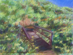
Dyar Spring Trail, Autumn, pastel, 2014 (shortly before cataract surgery)

I remember being very curious about how I would feel about the work I had done while under the visual influence of cataracts, but surprisingly (to me) – they were fine.  Their colors were relative to the image and made a cohesive painting – somehow,  I was still choosing the colors that matched the colors in my references well enough so that removing the orange “filter” of cataracts did not make me want to “re-do” those pieces at all.  I am afraid macular degeneration is going to affect it a great deal more over time, but there is no do-over for this condition. Yet. Maybe science will get there.

Coast Walk Rest, soft pastel, 2015 (after cataract surgery)
Beach After the Rain, soft pastel, 2023

For now, I am coming to terms with the idea that my art may become ever more expressive and less defined. Ironically I have often thought I “should loosen up” – be careful what you ask for!  I see that my new pieces looks rougher – or shall we say looser? – than my previous work, and I no longer have the visual acuity to refine it as I would love to do. As I struggle with  accepting the need for a new visual language, I guess I have to trust the impulse to create still has value, as it did for others who have gone before me. I hope that viewers of my work still find it engaging and meaningful and maybe even beautiful. Degas and Monet didn’t quit – should they have? I haven’t quit – should I?


Julianne Ricksecker with winning art at the Rene Carcan international Prize for Printmaking exhibition, Biblioteca Wittockiana, Brussels, Belgium, February 15, 2018. Photo: Ellen Pontes

Exciting news!  At the opening reception on February 15, I received the Public Prize Award in the biennial René Carcan International Prize for Printmaking for the 4 original prints that I have on display there! Thanks to all my friends, family and collectors who took the time to go online and vote for my work!

The exhibit is at the Bibliotheca Wittockiana, a museum in Brussels dedicated to book arts, book binding and related disciplines. The show opened February 15th and closes May 15th of 2018.

Enjoy the entire exhibit online here: http://award.renecarcan.be/current_edition

For San Diego locals, you can enjoy 2 of the 4 images at the Del Mar Art Center Gallery until April 30.  The joy of original prints is that they are “multiple originals”, and exist in a limited edition that can be on view in two places at once!

“Last Light” and “Resting on Razor Point Trail” can both be viewed in the gallery, located in the Del Mar Plaza, at the corner of 15th and Camino Del Mar. Gallery hours are Tue – Sat, 11-7 and Sun, 11-6.

Torrey Pine #3, monotype, René Carcan International Public Prize in Printmaking
“Last Light”, etching and aquatint, 8″ x 10″, René Carcan International Public Prize in Printmaking.
Resting on Razor Point Trail”, Etching and Aquatint, 3′ x 3.5″, René Carcan International Public Prize in Printmaking.
Harris Beach, Oregon, Color etching, 10″ x 12″, René Carcan International Public Prize in Printmaking.

Exciting news!  I have been selected as a finalist in the René Carcan International Grand Prize in Printmaking!

All finalists’ art is now posted in the René Carcan website for public voting.  I would love to have your vote for the Public Prize!

When you follow this link, you will see my 4 pieces – you can click on each one to see it enlarged, and to vote for it by clicking “Like”. You may vote for more than one piece.  This is like the “People’s Choice” awards we do at shows locally – it won’t influence the judges, but it would be quite an honor to receive.
http://award.renecarcan.be/node/1897

Please share this with others, especially those who love original prints, and ask them to support my work in this simple way!

Harris Beach Oregon, color etching, nominated for the René Carcan International Prize in Printmaking.

The selected finalists will exhibit at a museum in Brussels, the Bibliotheca Wittockiana, a museum dedicated to book arts, book binding and related disciplines. The show opens February 15th and closes May 15th of 2018.

In another round of jurying, a panel of experts will examine the actual prints to select a printmaker for the René Carcan International Grand Prix. There are also a 1st and 2nd Mention, as well as the René Carcan Public Prize, selected by a public vote. See all of the finalists’ work here:

http://award.renecarcan.be/current_edition

I am thrilled to announce that I have been selected as a finalist for the René Carcan International Prize For Printmaking! This biennial award and exhibition is presented by the Espace René Carcan, whose mission to promote the artistic heritage of the Belgian printmaker and watercolour artist, as well as provide recognition of the art of printmaking in general. You can learn more about René Carcan’s work here.


“Last Light”, etching and aquatint, 8″ x 10″, René Carcan International Public Prize in Printmaking.

The nominated printmakers will exhibit at the Bibliotheca Wittockiana in Brussels, Belgium, a museum dedicated to book arts, book binding and related disciplines. The show opens February 15th and closes May 15th of 2018.

In another round of jurying, a panel of experts will examine the actual prints to select a printmaker for the René Carcan International Grand Prix. There are also a 1st and 2nd Mention, as well as the René Carcan Public Prize, selected by a public vote. I will let you know when you can look for the public voting process online!

UPDATE: Public Prize voting is now open!  If you visit here: http://award.renecarcan.be/node/1898
you will see a page with my 4 pieces.  There should be a “like” button next to the enlarged image.  “Like” = Vote.  You may click on each image to see the “like” button for that image. Apparently you can vote for as many images as you want, but you can only vote one time for a specific image.  NOTE: it requires a Facebook account to vote.

I love Yosemite National Park for its amazing rock formations, astonishing waterfalls, and beauty at every turn of the trail. River Bend with Half Dome is a view of the famous Half Dome formation viewed from a bridge over the Merced River.

I was out early in the morning to start a hike to one of the waterfalls that feeds into the Merced, and was taken with the cool, soft colors of the morning light, especially the blues and purples of the glacial carved rock. I knew well that these colors would change dramatically as the sun rose higher and the day grew hot. I wanted to capture this cool morning feel in an etching.


River Bend With Half Dome, 2-pate etching
Torrey Pine #1, à la poupée etching

There are a number  of ways to make an etching in multiple colors.  One approach is to use more than one plate, printing each plate on top of the previous print.  This method has inherent challenges with registering the plate and the paper so that the images line up precisely.  Add to that challenge the fact that the paper must be damp in order to pull the ink from the incised areas of the plate.  When the paper runs through the press, felt blankets cushion the process, and moisture is pulled from the paper.  The paper stretches as it runs through the press, and begins to shrink immediately as it dries. The paper shrinkage can cause the images to misalign. In sunny Southern California with our extremely low humidity most days, and this adds a significant extra challenge to the registration process. 

Consequently, I usually prefer to use a different technique to pull my color prints, a process known as à la poupée, in which I ink discrete areas of the plate with different colors and run it through the press only one time. See a previous blog, Working Out the Color Wipe: A La Poupee Printing, for more on this technique.

First plate for blues, purples and sienna in the water

I usually need large areas of color for the à la poupée process to be successful, and I could see that my planned image would have several areas that would be difficult to wipe à la poupée at the juncture of the greens and the purplesThe solution was to combine these two processes to mitigate the challenge.  I created two plates, each inked à la poupée in multiple colors.


The first plate, zinc etched in aquatint tones, will be wiped in blue for the sky, two shades of purple for Half Dome, and sienna for the shadows in the river.

Second plate for 2 greens and sienna


The second plate, also zinc etched in aquatint tones, will be wiped in dark green, yellow green and brown.

The next few pictures illustrate the plates printed in black ink, showing how each prints alone and how they align when printed on one paper.

plate # 2 in black


The two plates printed together in black

Note that the print is backwards from the plate. In order to have the final image appear as the original view, the plate must be a mirror image.  In many cases, I don’t worry about this, but for some famous and well-known landmarks, I reverse the image on the plate. Notice also the plate mark, the indentation from the paper being pressed over the plate. This mark is characteristic of intaglio printmaking processes.

Plate # 1, inked and wiped, on the press bed.
Laying paper on Plate # 2 on the press bed, after printing plate # 1.


Plate #1, inked and wiped, is placed on alignment marks on the press bed, ready for printing.  Note the 4 colors, and how the rest of the surface of the plate is wiped “clean” so that it will be white in the print.


When plate #1 has run through the press, the paper is captured under the roller to prevent it moving.  The second plate is carefully placed on the press bed on the alignment marks, and the paper lowered onto it.  Then the felt blankets are lowered and the second plate is run through the press.

Once the plates are completed, the color proofs are made.  There are usually a series of proofs establishing the precise color mix desired for the final print.  These early proofs are usually destroyed.  The first proof that captures what I am going for is called “bon à tirer” (literally, good to pull).  This print remains in my collection and is the print all others should match.  After that, printing of the edition can begin.

The resulting print, River Bend with Half Dome.

River Bend With Half Dome, 2-pate etching

As with most of my editions in the last 25 years, I only print a few images in the edition, and  then I put the plate away.   I keep very meticulous records of what has been printed. Should those early images find homes, then I will pull out the plate and print again. In the meantime, I am on to the next creative challenge!

River Bend with Half Dome is currently on display in “One Foot in the River” at the Lillian Davis Hogan Gallery at St. Mary’s University of Minnesota in Winona, MN


Sagami-wan, etching and aquatint, ©1978, Julianne B Ricksecker


As an artist who works primarily on paper surfaces that need to be framed for protection from the elements, I have long been concerned about using archival materials for framing and handling: museum or rag mats, archival clear wrap for matted work that will be displayed in bins.

But as a young artist starting out, I relied on the expertise of the framers I took my work to for advise on framing decisions.  I recently learned from experience that at least one of those framers led me in the wrong direction.  In her defense, she might have been giving me industry standard counsel at the time, but I have a piece of art that clearly shows the error of the technique.  It is also interesting that there are two pieces, framed in the same way at the same time, and only one of them suffered acid damage. I have to guess that the different rag content of the two printmaking papers caused diverse outcomes.

I am no longer a young artist, and some of my work has been in frames for a long time.


The two particular pieces that I looked at this week were framed about 35 years ago. When I pulled them out of storage to check them out before sending them out on exhibit, I noticed that the glass looked smeared. However, cleaning the glass did not help.  I was puzzled about why the inside of the glass would look dirty, but I opened up the frame to clean it.

Untitled (ring around the moon), etching and aquatint, ©1978


dirty glass

I found a milky deposit on the inside of the glass everywhere that the black rag mat touched the glass, and the black ink from the print was offset on the glass in the same milky deposit. I am not sure what this is and am not sure it would have been so apparent if the deposit hadn’t been whitish and the mat pure black.

closeup of milky deposit


deposit wipes off


milky film on glass – Sagami Wan


milky deposit and offset image on glass
acid damage on image from framing with non-archival materials

No part of the print was touching any non-archival surface.  Behind the print was a 2-ply rag mat that was in perfect condition.  The black  mat, which was supposed to be acid free (I don’t remember if it was “rag”), was in perfect condition.  But the foam core that was used as a backing board behind the 2-ply rag mat “barrier mat” was not an archival material.  It was believed that the barrier mat would protect the print from the acidity of the foam core. I can only guess that the damage to the print, and possibly the scum on the glass, was the result of  out-gassing of some kind from that foam core backing. The out-gassing, remaining inside the frame package, was able to impact the paper of the print wherever the was air space between the glass and the print. It did not, however, seem to injure the rag mats.

What I noticed next was the shocker.  I lifted the mat from the print, to see if the mat was causing an acid burn on the paper. I found that the mat had perfectly protected the paper, but where the mat window was open and the print exposed to the air behind the glass, the paper was burned yellow.

I found it interesting that the second print, framed identically at the same time, did not experience this damage. The glass had the same off-set of the image and the same deposit where the black mat touched the glass.  The printmaking paper of the second print has a higher rag content, and apparently was less susceptible to environmental damage.

Needless to say, after cleaning the glass, I replaced the backing boards with newer acid free archival foam core backing boards.  And replaced the burned print with a different impression from the edition, which has been stored flat and unframed.

This is one example of what acid damage from non-archival  framing might look like. It’s highly unlikely that I will be around to check on them in another 35 years, but I am hoping that current “acid free” and “archival” materials are truly superior to the framing materials and understanding of1981.  I have not yet destroyed the burned print.  I am thinking about  experimenting with it.

Technical notes: The paper that was “burned” was Arches printmaking paper and in the 70’s, I believe it was 40% rag.  The paper that did not “burn” with the same framing treatment was Rives BFK, which I believe has always been 100% rag.


untitled monotype doodle

I signed up to demonstrate printmaking at the San Diego County Fair.  Watching me draw a new plate for etching is a little like watching grass grow, and isn’t very engaging for Fair attendees, so this year I wanted to do a demo of monotype printmaking. It is a little more painterly and more important, it works up faster.


I decided to use the opportunity as an excuse to work with a set of inks (Akua) designed especially for monotype printmaking as a non-toxic watercolor ink.  I had purchased them a couple of years ago and really hated how they handled, compared to my usual process, but I had seen online that others were using them successfully.  So I determined to do some practice sessions in the studio and try to make friends with this material. (Art materials are expensive!)


My first attempt was just doodling. Ok, I can see some possibilities here. It looks very grainy, which I am not fond of. With heavier ink and more pressure, it might work for me.


Bench on Coast Walk, monotype


Second attempt, on the press this time, got some nice ink coverage but the pressure was very high to get this smooth look. It was hard work to pull the plate through the press, even on 25:1 gear ratio.


Painted the same composition and used a little less pressure – far too pale and grainy! That is why it is called experimenting!


Tried another image – with tighter pressure. This image works well with the grainy quality of the ink.  After adding ink to darken select areas defining the rocks on the beach, and running through the press again, this was a passable result.


I feel encouraged that I might make friends with this ink yet!  I try one without the press.   In the demo situation, I will have to print by hand, using a spoon or a baren to apply pressure.
Although I re-inked and overprinted several times to get to this end, I felt good about the possibilities after printing this image. I turned to making sketches for the demo days.


Since I paint the image on clear plexiglass, it is possible to lay the plate directly on the sketch to guide color application. This sketch was used for the second demo.


On demo day, I had some materials for kids (and parents and teachers!) to play with – so in the end, the first monotype at the Fair did not get completed.  I covered the partially painted plate with a second plate and clipped them together.  I had heard that these Akua inks stay wet for several days, so I thought, “Why not?  I’ll print it at home tomorrow.”


It was a couple of days before I got back to it.  Even though I knew it wasn’t “finished”, I thought I better print just to see whether the ink would still work.


I was very pleased that the film of ink was still wet enough to transfer pretty well even after 48 hours.


The composition needed more work, however, so I added a series of layers of additional colors, printing repeatedly until I felt happy with the result.


For my second demo day, I had another flower image. This time the demonstrator table (and the demonstrator!) were in sun a good part of the time.  The ink felt like it was drying very fast in the heat and sun, so  I printed at the end of two hours.


Alignment for the printing is pretty simple with the clear plexiglass, however it was still useful to tape the paper to the plate for ease and speed of repositioning the paper for subsequent printing.


By adding more color layers, the grainy quality that I don’t like gives way to a richness of color that I do like.

Note that, once I began darkening the background around the flower petals, I actually drew with marker on the back of the plate, tracing the precise placement of some elements as they were already printed.

While the audience thought this looked pretty nice, I know that the “magic” of seeing the print pulled was a big influence on their impression!  I took it home and added more layers to enhance the composition over the next few days.

Titleld “Dallas’ Cactus Blossom” after the homeowner in whose beautiful garden I found this lovely specimen.