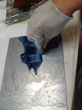
Spit bite: painting acid directly onto the Aquatinted plate


In the last post, I talked about creating aquatint tones using hard ground and paint markers to cover the plate and protect it from the acid.  In another process, the acid can be painted directly on the plate to create subtle effects and soft edges.


The plate is covered in an aquatint ground (a ground of tiny speckles that will result in very small raised points of metal when etched.  See How Tones Are Created in Etching for more detail on this ground.)

Next, any parts of the plate that need to be protected from the acid are covered in a solid acid-resistant ground, such as liquid hard ground. This appears coffee-colored in the above photo.

Now the fun begins.  Using a weak solution of acid and an animal hair brush, the prepared plate is literally painted with acid. Acid can be stroked onto the plate, dripped onto it, or dripped into puddles of water that have been painted onto the plate.

Because the acid is weak and is depleted quickly in this process, areas that are to retain ink need to be painted over and over with the acid, until the etch is deep enough to hold the desired amount of ink.  It is not possible to tell just

Spit bite plate
The plate is stained from the acid

from looking at the plate exactly how deep the etch has become, so it is important to have a sense of how many times a given area has been painted with acid in order to gauge progress.  The application of acid to the plate in this manner results in the plate appearing stained, but the varying color of the stain does not relate closely to the eventual tone in the print.

When the artist determines that the spit bite is deep enough, the plate is flushed with water, and dried.  All of the grounds are removed, and the plate is inked, wiped, and printed to check on progress.


Using paint marker for highlights in the waves


For this image, however, I chose to continue to develop tones for areas representing sand and surf.  I used paint marker to protect the highlights in the waves.


Another technique I like is to draw over the aquatint ground with a china marker (grease pencil).  This is another way to create subtle gradations of tone in the aquatint.

Using a china marker for subtle gradations in the sand


Again, development of tones proceeds by soaking the plate in acid,  then using paint marker and china marker to cover more of the plate and soaking in acid again.


Here you see continued development of tones for sand and waves. Eventually the areas still exposed to acid are very small.


Eventually the area being etched is very small.


Finally the grounds are cleaned from the plate.  The bare plate gives some idea of how the plate will print if you look at how light reflects from the surface.  The spit bite areas are somewhat deceptive because of the irregular acid staining.

The bare plate after grounds are removed.


Next step is to ink and wipe the plate, and print it on the etching press to check progress. Here is a view of the press, which has rollers above and below the traveling bed. Note the felt blankets folded up out of the way, waiting for the plate and paper to be set upon the bed.


The inked plate on the press bed.


The plate is inked and the surface is wiped with rags.  Now you can see more clearly how the acid has affected the plate, especially in the spit bite areas.

Damp paper paced over the inked plate


Damp paper is placed over the inked plate, and covered with soft felt blankets. The resulting sandwich is rolled through the press.


Felt blankets (3 layers) are lowered onto the press bed.


After rolling the bed between the rollers, the pressure pushes the paper fibers into the plate to transfer the ink to the paper. Note the plate marks visible from the back side of the paper after the plate has gone through the press.


Here is the black and white proof (print) of the etched plate.  The spit bite has produced a brooding grey sky of indistinct clouds.

The next process in developing this image will be mixing colors and proofing the plate in color.


Morning Mist, aquatint

If you have ever wondered how the fine tonal areas are created in an etching, here is an example of a modern method.

The idea is to create a speckled pattern of an acid resistant material on the plate so the acid can eat around the speckles, leaving tiny raised metal points. When ink is applied and then wiped with rags, the depth of the etch determines how much ink remains on the plate, and therefore, how dark the printed tones.  In the example at left, the palest tones  resulted from a 10 second dip in the acid, while the darkest areas soaked in the acid about 15  minutes.


So what is thus mysterious speckled resist?  In modern times, we can use spray enamel paint for a quick and reliable method to cover the plate in a fine and even mist.

Aquatint ground for tone
Aquatint ground on plate
Krylon Spray Enamel
Krylon Spray Enamel for making aquatint ground

In the image at the left, you can see that the coverage of enamel is at 40% or so. Coverage in the range of 40% – 60% will work well.

Painting hard ground

Next, the same liquid wax and asphaltum ground that was used to cover the plate for the line etch is now painted on the plate to protect areas that will have no etched tone.


IMG_2689

Sometimes very fine brushes are used to work delicate details.

When the areas of the plate that need to remain “white” are protected with ground (which looks coffee-colored in the photo), the plate is ready for an acid soak.


The plate will be bathed in the acid repeatedly to achieve a variety of tones.  When the plate is removed from the acid, it is rinsed with water and dried.  Then additional ground is placed on the plate to protect the tones just etched before it is returned to the acid to continue etching some areas to a deeper level. The longer the aquatint soaks in the acid, the darker the tone will print.

IMG_2692


I could use the regular liquid hard ground for this purpose, but for complex tone development, I find it easier to visualize the tones I have already etched if I use paint markers in different colors to protect the plate for subsequent etches in the series.IMG_2693


I start with a general plan of how many times I will return the plate to the acid, and for how many seconds or minutes each acid bath will be.  This plan comes from years of experience, a sense of how potent the acid bath is, and noting how warm the studio is.  I keep notes of how long the plate has been in the acid as I progress, so that I can keep track of how long the still exposed areas have been etched in total. Many of my plates have 6 – 10 separate acid baths during this phase of development, and it is easy to forget just how many times the plate has soaked, and for how much time.

Finally, all of the enamel, hard ground and paint marker is removed from the plate, and the plate is inked and printed to check progress.

The acid has etched between the speckles of enamel, leaving a high point at each place where enamel adhered to the plate.  When inked and wiped, the plate will hold ink between these high points.  The more difference between the high points and the depth of the etch, the m

MacKerricher Beach, Second State Proof

ore ink the plate will hold.  If you look closely at an aquatint print, you will see the fine pattern of white spots from these high points of metal.

I could  scrape or burnish some of the aquatint areas to give more subtle variations in the tone. Burnishing is like lightly erasing – is will make the aquatint print in a lighter tone.

Note that there are a few unintended marks in the “sky” area – this is where the hard ground was not thick enough and allowed the acid to seep through; this is known as “false bite”.  If it does not work with the image, it will be scraped and burnished to clean up the area.

The next step will be to create a brooding sky with a technique called “spit bite”, and some sand in the foreground with surf tumbling up between the rocks. That will be for my next blog!

Last time I wrote about preparing a zinc plate to begin the etching process – the work that needs to happen before image making even begins.

Grounded plate
Plate covered with ground

Today I’ll show how an image is etched into the plate. Since the etching literally occurs by soaking the metal plate in nitric acid (hence the term “etching’), the first order of business is to protect the plate from the acid. As my resist, I use a liquid ground made of asphaltum and wax, which dries hard and smooth.


Preliminary Sketch
Preliminary Sketch of MacKerricher Beach


Transferred Sketch
Sketch transferred to grounded plate

I usually work out the composition in sketches first, and may make a full size drawing.  The basic outlines of the drawing can be transferred to the plate using a transfer paper, similar to a dressmaker’s carbon.

Drawing with the needle


The line drawing is done with a needle, scraping through the ground with the fine point.  The idea is only to expose the metal plate to the acid, not to scratch the plate.

IMG_2626
Developing drawing with cross hatched lines


Whether using a transferred outline, or drawing freehand, the needle is used to draw lines and to create shaded areas using cross-hatched lines. The drawing is sensitive and delicate, using the transfer drawing as a general guide only

Needle drawing on plate


Soaking in nitric acid
The first etch: soaking line drawing in nitric acid


When the drawing is satisfactory, the plate is soaked in nitric acid for 10 – 40 minutes, depending on the strength of the acid and how deep I desire the etched lines to be.


Etched plate, line drawing


When the etching is complete, I clean the ground from the plate, and print a proof to check the etch so far.

I scrape ink over the plate, forcing the ink into the incised lines.  Then I use rags to wipe ink from the surface of the plate until all the un-etched surfaces are clean.

Next I place the inked plate on the bed of the etching press.  Damp paper is placed on the plate, and several layers of felt are laid down on top of the paper.  This sandwich is rolled through the press, which has rollers above and below the press bed, squeezing the fibers of the paper into the incised lines on the plate.

Printed image and inked plate on press bed

When the paper is lifted from the plate, the image has been transferred to the paper. Note that the printed image is the reverse of the drawing.  When designing an image of a well known landmark, I reverse the drawing so that the final image will be familiar to the viewer.


Next time, I will show how tones can be etched into the plate. I’ll add a cloudy sky, surf, and sand to the image.

Tueeulala Falls
Tueeulala Falls, etching, ©2009, Julianne B Ricksecker


Last week I started preparing plates for a new series of etchings for the “7 Printmakers” exhibit in San Diego in October. I wondered as I worked how many non-etchers know what goes into preparing metal plates to create an original etching?

Milled plate surface

Etchings are original prints, printed on paper from a plate that was created by the artist, and inked and  printed by hand by the artist or a master printer.  See Intaglio Printmaking Technique for a little more information about etching the image and printing the plate.

Before the image-making work can even begin, there is work to prepare the plate for the process. I work on zinc, which is milled in such a way that the plate is smooth and flat, but it has a dull surface with a vague pattern from the milling. If inked and printed without any prep work, the plate would produce a uniform dirty grey tone.

Plate Preparation Supplies

In order to create a surface that will wipe clean for printing (remain white in the final print), it is necessary to polish the surface of the plate to nearly a mirror shine. I start by polishing the surface with a fine sandpaper, and then use progressively finer sanding films.  The last few polishes are done using very fine polishing compounds on a soft cloth.  #0000 steel wool is used to buff a nice shine.

Dull unpolished plate surface


The purpose of all this polishing is to create a very slick surface that will not hold ink when the plate is wiped for printing. It is important to create this surface before creating the image in the plate, as the act of polishing would alter the etched image. (Note the dull finish of the plate in the photo at left, and the mirror like shine in the photo at right.  The pencil is used here just to illustrate the reflectivity of the two plates.)


Reflective surface after polishing

Unbeveled_edge

The second important step in plate preparation is beveling the plate to remove the sharp edges and corners so that the plate will go through the press without tearing the paper and the felt blankets.  Sometimes I (impatiently) skip this step until I am ready for proofing the plate, but it is safer to bevel the plate before the image is created!  A slip of the beveling tool could damage the image, I have learned to my dismay!

I was taught to bevel etching plates using a metal file, but I get better results using an edging tool made for beveling plexiglass.  It allows me to shave the edges of the plate into a nice rounded bevel.  (Beveling tool is pictured at the bottom of the photo of supplies.)  The plate is clamped overhanging the edge of a table, and the tool is repeatedly scraped down the length of the plate until the desired bevel is achieved.

Beveled edge of etching plate


The scraping leaves scratch marks that can hold ink, so the bevel will need to be burnished and polished before edition printing. I usually wait until all of the etching of the plate is complete before finishing the beveled edge to a smooth shine.


Next time I will write more about how the design is etched into the plate.

Debordieu Summer, Monotype
Debordieu Summer, Monotype, 1.5″ x 2.5″, ©2013, Julianne B Ricksecker
Boardwalk, Monotype
Boardwalk, Monotype, 1.5″ x 2.5″, ©2013, Julianne B Ricksecker


The juried piece will be included in the wall display, but they maintain binders of additional work by the selected artists for the duration of the exhibit to maximize sales opportunities.

I was recently accepted into an international miniature print exhibit to show a monotype image measuring 1 1/2″ x 2 1/2″ – a total of 4 square inches.  (That is smaller than a business card.)  The organizing group – The Center for Contemporary Printmaking – emailed me an invitation to send an additional 6 “variant or similar” monotypes to accompany the show.

Fence on the Dunes, Monotype
Fence on the Dunes, Monotype, 1.5″ x 2.5″, ©2013, Julianne B Ricksecker

My usual approach to monotype doesn’t include making similar or variant prints – so I did not have work already available to send – in fact this was the first time I had attempted a miniature monotype! Most of my monotypes are 11″ x 14″ or larger.

I thought about what inspired me to create the first miniature  monotype and decided to pursue that inspiration further to come up with additional imagery and energy for new work.  “On a theme” seemed a reasonable criterion.

Sea Wall, Monotype,
Sea Wall, Monotype, 1.5″ x 2.5″, ©2013, Julianne B Ricksecker

The first miniature, “Sea Wall” was inspired by memories of the South Carolina beach on Debordieu Island that I had visited many summers with my mother.  Since Mom passed away last September, she has been on my mind frequently, and I was drawn to those beach memories in rememberance of how much she loved it there. The sea wall on the sand was something she and I had talked about and I enjoyed the juxtaposition of the man-made structure next to the sand and the water.

Storm on Debordieu, Monotype
Storm on Debordieu, Monotype, 1.5″ x 2.5″, ©2013, Julianne B Ricksecker


When planning the new pieces, it was May, the month of Mother’s Day and also the month that Mom would have turned 89 years old. I looked through my photos taken on trips back to visit her to find other images of the beach and the dunes on Debordieu Island that incorporated that element of something man-made juxtaposed with the wild beauty of the dunes and the sea.

Many of the resulting images were views from the homes we stayed in over the years when the family gathered in South Carolina to enjoy the beach, walks in the sand,  catching up on family news, and long nights of games and laughter.

Bench on the Dunes, Monotype
Bench on the Dunes, Monotype, 1.5″ x 2.5″, ©2013, Julianne B Ricksecker

It may be that South Carolinians would find these images of dunes and boardwalks rather mundane, but to this California girl, they seemed interesting and strangely beautiful, and imbued with memories of shared family time.


If you have the opportunity, visit the 9th International Mini Print Biennial at the Center for Contemporary Printmaking in Mathews Park, Norwalk, CT from June 2 – Sept. 1, 2013

Dune Grass, Monotype
Dune Grass, Monotype, 1.5″ x 2.5″, ©2013, Julianne B Ricksecker

I have a confession to make.  I have a love-hate relationship with monotype.

Plexiglass plate for monotype

I create monotypes  (one-of-a-kind prints) by painting on a blank sheet of plexiglass and transferring the image to paper using an etching press.

Usually I  think about the image for days or weeks before I start the process.  I do composition sketches – small black and white thumbnail sketches – to get a feeling for the layout and movement of the composition


Developing the image, adding color

When I am satisfied with the general composition, I may take a sketchpad or a sheet of butcher paper and do a rough sketch of the composition in full size.  This can be laid on the table under the plexiglass as a rough guide for the development of the composition in oil paint.

Nevada Fall, Monotype by Julianne Ricksecker


If I want a solid field of color as for a cloudless sky, I mix the color and apply it to the plate with a roller.


Monotype plate, drawing white lines with a clay shaper


I use rags and rubber “color shaper” or “clay shaper” tools to remove  color and create the line between color areas, or pick out highlights or linear patterns.


Monotype plate, lifting paint with paper towel

I use damp rag or paper towel to lift some of the  color, making it more transparent or creating texture or pattern. When the plate is printed, any part of the plate that is not covered in paint will appear stark white, since the paper will be untouched by paint.

I try to mix the major colors before I begin, in sufficient quantity to complete the monotype.  I do some color mixing on the palette as I work but I want to have the main colors mixed in advance with the appropriate amounts of extenders and retarders because those need to be mixed more by measure than by sight. It can be very difficult to estimate the transparency of the paint or it’s drying time if mixing “on the fly”!

Big Sur, Monotype by Julianne Ricksecker

The retarder is particularly important, I have learned to my chagrin. When I make a monotype, I need to complete the print in 4-6 hours – depending on the heat and humidity.  If I work too long, it is likely that the paper will stick to the plate, instead of the paint transferring to the paper.  Sometimes this occurs in just a small area, tearing a hole right through the image.  Quite a disappointment after working on the print all day! This is when I “hate” monotype!

“Big Sur”, pictured at right, was just such a disappointment on the first and second attempts.  Third time was the charm for this monotype!

Fishhook Cactus, monotype plate, ready to print

I develop the image, using water to thin the color and even sometimes pool water on the surface of the plate and drop color into it.  Because the plate will be rolled throu

gh an etching press to transfer the image onto paper, it is necessary to let the pooled water dry before printing! The application of paint must be thin enough that it does not “squirt” or blot when rolling through the press.  It takes a little practice to get the right film of paint to achieve the color density desired, without causing the paint to run. 

Fishhook Cactus, Monotype by Julianne Ricksecker
Fishhook Cactus, printed monotype

When the monotype works well, it is a magical feeling. No matter how many monotypes I do, I cannot predict exactly what it will look like once it transfers to paper.  I can get an approximation of the final result by lifting the plexiglass plate, and turning it over to look through it to the white table, or at the skylight.  Neither of these views gives a perfect idea of the final print.  I don’t know the outcome until the paper and plate have been rolled through the press, the blankets are thrown back, and I peel the paper from the plate.  This is the magic moment! This is when I love monotoype!

Wildflowers, Culp Valley, oil pastel


I love visiting the Anza Borrego desert in the spring.  In some years the flowers are incredibly dense on the desert floor and in other years, they are sparse and require great attention to detail to spot them.


Desert flowers show up in my work, sometimes focused on individual plants, and sometimes in a landscape celebrating the riot of color splashed across the desert.


Fish Hook in Blossom, Monotype by Julianne Ricksecker


In either case, I enjoy “revisiting’ spring color throughout the rest of the year by creating art from photos taken on a springtime hike. This is especially satisfying if I missed my usual spring trek to the desert!

2012 was such a year, so recently I pulled out photos of last year’s visit to Desert Gardens and Coyote Canyon.  On the particular day we went. There were abundant lupine blooming, and frequently this summer I have been remembering several views of them.

Lupine, Coyote Canyon, soft pastel by Julianne Ricksecker
Lupine, Coyote Canyon, soft pastel


Here is a soft pastel of “Lupine in Coyote Canyon” which is  displayed at the University Club of Phoenix from September 7 – November 11.

Check out more scenes of spring on the desert at my Anza Borrego Desert page.


La Jolla Coast, collagraph, Julianne Ricksecker

Over the years I have explored many original printmaking processes including monotype (one-of-a-kind prints), etching, viscosity printing, drypoint and collagraph. Each has its unique charms and challenges!

One interesting example of a collagraph process was done to resemble a mezzotint. Mezzotint is a metal plate that has been scored and roughed up so deeply that, when inked, it will print a solid, velvety black.  The image is developed by scraping the rough surface and burnishing it to create lighter areas in all that darkness.

Healing and Peace in Midnight Abide, silk collagraph by Julianne Ricksecker


Collagraph is a plate that is a collage of almost any materials, glued to a plate, sealed with acrylic and then inked and printed.  The textures of the glued materials hold ink and are visible in the final print.

I wanted to explore the possibility of using fabric on a collagraph plate to create rich darks similar to those seen in a mezzotint.  I had recently stretched a very fine nylon fabric on frames for serigraphy (or screen printing). I thought that might be too fine a mesh, so I found another similar fabric that was a little coarser in texture.  I covered a piece of mat board entirely with the fabric, gluing it down with acrylic gesso.  To develop the image, I painted layers of acrylic gesso and acrylic mediums to fill up the mesh of the fabric, working from dark to light.

Where I wanted the image to print grey or white, I used more layers of acrylic. As a final touch, I used gloss and matte mediums to control how white the lightest area would wipe.

El Capitan, silk collagraph by Julianne Ricksecker

The resulting print, “Healing and Peace in Midnight Abide”, has the same rich blacks as would be found in a mezzotint.  A mezzotint afficionado might notice that the light areas have different characteristics than a mezzotint, though the overall effect of an image emerging out of darkness is similar.

Another print, made with the same fabric as that used for screen printing, is shown in “El Capitan”. In this collagraph, the emphasis was on using the acrylic medium to create a very tactile textured surface to evoke the weather- and glacier-sculpted ediface of El Capitan and neighboring cliffs.


From the earliest age, I was interested in portraying the world visually. Writing assignments in grammar school were always elaborately illustrated. As a young college student, I applied for a semester abroad program in France so that I could visit the Louvre. I vividly remember the exhilaration of experiencing so many paintings in the original that I had only seen as book or poster reproductions until then.

La Jolla Tide Pools, oil pastel by Julianne Ricksecker

Although my early inspiration to be an artist was mostly from oil paintings, I have never really enjoyed painting in oil!  At least not oil on canvas!

My favorite subject matter is realistic landscape in a variety of media.  Some pieces are worked in direct methods, such as watercolor or pastel, but my original prints are indirect, created first on plates, which are then inked and transferred to paper on an etching press. My creative process involves experiencing a place, hiking and taking photographs and making sketches. Then I return to the studio to create the final work.

Rag wiping an intaglio plate for printing


When etching plates are inked and wiped, it is a messy business!  The tacky oil-based ink gets all over my gloved hands and then ends up all over the back of the printmaking plate.  After the etching is printed and the plate is lifted from the press bed, sometimes there is ink left on the surface of the bed.  This accidental transfer of ink sometimes suggests an image, in the same way that you might see images in clouds.

Rodney, Monotype by Julianne Ricksecker

The image can be manipulated with rags and brushes, even additions of more ink, and then printed onto paper, creating a one-of-a-kind print known as a monotype.

After playing with this accidental residue of ink to create spontaneous monotypes a few times, I began to explore the possibilities of monotype for it’s own sake, using a blank plexiglass plate and a planned approach.  Initially I used oil paint to create these images, but found the transparent colors I desired required too much oil and thinner to be viable for printing on paper.  About this time, oil paint appeared in art stores in a water-soluble form. The paper is normally damp when passing through etching press, so the new oils seemed like a perfect solution for monotype.

With a little experimentation, I found this new paint to be a very satisfying and versatile medium for my landscape work.

St Mary River, Monotype by Julianne Ricksecker


Because the ink is water soluble, it can be thinned with water for very transparent washes. This seemed ideally matched to my fascination with imagery of water and waterfalls.

There are many ways that artists approach monotype printmaking, sometimes called “painterly printmakng”. Think about Degas’ ballerinas (monotype, sometimes with the addition of pastel) or Henri Matisse’s white lines on a rich black field, or Georges Rouault’s loose, fluid brushwork as in “Clown with Monkey”.

Cascade Falls, Tetons, Monotype by Julianne Ricksecker

My approach is to use a full palette to develop a realistic landscape. Through the use of additive mediums, I can emphasize the brush stoke or minimize it to create soft passages of color.  I may use rollers to apply a solid field of color, or rubber tipped sticks or very fine brushes to remove color.  I may also press paper towels or bits of lace into the paint to remove color in a textured patterns.

The resulting images truly live up to the name “painterly print”.

My original prints and paintings have been exhibited in Regional, National and International competitions. I was awarded the 2nd Place Award for my miniature prints in the 8th Biennial International Mini-Print competition at the Center for Contemporary Printmaking in Connecticut in 2011. My work is regularly on exhibit in the greater San Diego area.

I have been invited to present my work in a solo exhibition in Phoenix, Arizona fromSeptember 7 to November 11, 2012 at the University Club of Phoenix.  If you are in the area, I hope you can join me!

Moose Falls, Monotype by Julianne Ricksecker


Artist Reception
September 7 from 5:30 – 7:30.
Hors D’oeuvres – No Host-Bar
Please RSVP to uclubphx@qwestoffice.com
(602) 254-5408

University Club of Phoenix

I am often asked why I choose a particular medium when creating new work.  It’s an interesting question for an artist who works in many media instead of specializing in only one.  There are actually a number of answers to the question, often influenced by what exhibitions I am getting ready for.

One answer is: I may need work in specific media for an upcoming exhibition.  Another answer is, the image has been in my mind a while and a way to treat it in a certain medium suggests itself.  Or, I may find myself longing to work in a certain medium just because I haven’t used it in a while.

After the Rain, Oil Pastel by Julianne Ricksecker

Sometimes, I know immediately when I see something inspiring which medium I prefer for the image. “After the Rain” is an example – I knew as soon as I saw this rain-drenched rose  that I wanted to paint it in oil pastel. I wanted to work through the challenge of painting the water droplets on the petals and the stems.

I usually have a number of images that I am mulling over, knowing I want to portray a certain scene or a particular flower but not knowing which technique I want to use.  It may come to me, while thinking about what imagery to create for an all-print exhibition, that a specific image will lend itself nicely to treatment in etching.  During this process I may consider another image and decide on a different medium for that composition – and postpone that work for a while.

In this way, I often have several images in mind, including possible technical treatments, while I am working on another piece. Some pieces stay in this mulling mode for months or even years before they are finally realized.

Timelines, etching by Julianne Ricksecker

Monotype presents itself as an attractive option when I am preparing for an exhibition of original print techniques and I am running short on time to come up with the requisite number of new pieces. Under the deadline pressure, I may cast around in my group of potential images for one or several that would work well in monotype. Monotype is also the medium that demands the most spontaneity, so it becomes an appealing option after completion of several etchings with long, meticulous plate development processes, such as “Timelines” (above) which took three and a half months to complete.

Illilouette Falls, Monotype
Illilouette Falls, Monotype by Julianne Ricksecker

Monotypes are one-of-a-kind prints. I use water-soluble oil-based paint on a blank sheet of plexiglass.  Once I begin to paint, I need to print within 4 – 6 hours.  This forces me into a totally different working mindset from any other medium that I use. There is always the possibility that the days’ work will be lost – not every monotype is successful on first attempt. Some go on to become mixed media work, by enhancing the print with pastel, color pencil or watercolor.  For others, I repeat the experiment until the monotype idea is fully realized.

Some of the joy of creating in different media is that they handle differently, and I feel like I am always learning.  Working in one medium, I feel inspired with an idea of how to use a different medium in a new way.